Web Accessibility on Multiple Assistive Devices.
In today’s digital world, website accessibility is not only a good practice but also a legal requirement. It ensures that all users, including people with disabilities, can navigate, interact with, perceive, and contribute to the web. Making websites accessible to all types of users not only follows legal requirements such as laws outlined in the Americans with Disabilities Act (ADA) or the Web Content Accessibility Guidelines (WCAG), but it also captures a broad scope of site visitors and improves the user experience for everyone.
Tips for Making a Website More Accessible (for CMS Users)
The following is a list of tips for web editors who are using Cascade CMS or other third-party Content Management Systems:
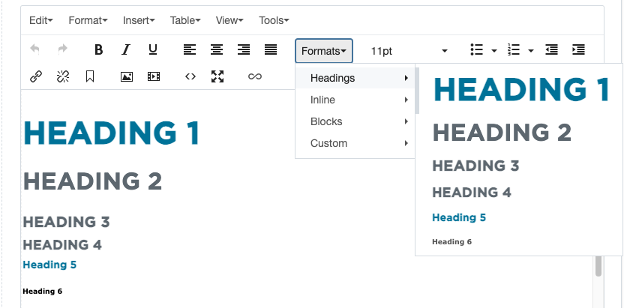
- Always Use the Correct Heading Level: The HTML headings have 6 levels: Heading 1 to Heading 6. These headings help define the hierarchy and the structure of a webpage:

Fig. 1: Different heading levels
Heading 1 is the most prominent and should be reserved for the main title of the webpage. Since it signifies the highest level of importance, it is typically used only ONCE per page. For section titles within the page, use Heading 2. If a section has subsections, employ Heading 3 for those titles and so forth in descending order of importance. Additionally, assistive technologies rely on these headings to navigate and understand the structure of contents. It is crucial not to skip heading levels (e.g., jumping from Heading 2 directly to Heading 4 or 5) as this can confuse users relying on these devices. Finally, headings should not be used solely for styling purposes, such as making text bold or larger. Their primary function is to denote the hierarchical structure of content (TutorialRepublic, 2024, Eggert & Abou-Zahra, 2017). - Always Provide Alt Text for Images:

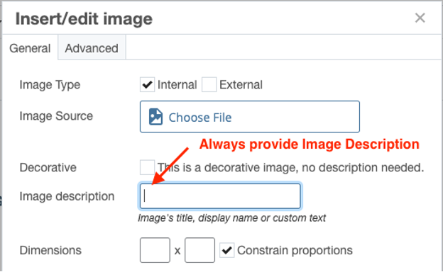
Fig. 2: Providing Image Alt Text
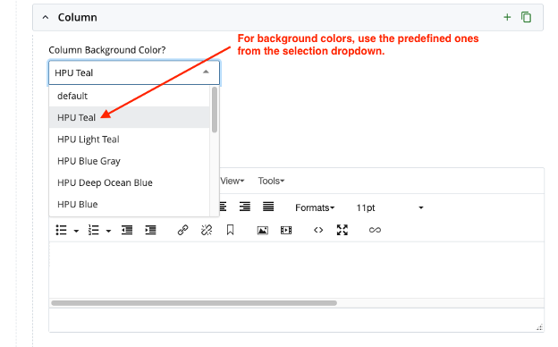
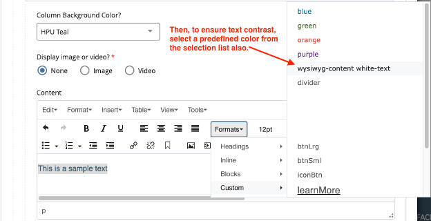
Not all users can view images on a webpage, so providing alt text is crucial. Alt text enables visually impaired users to understand the context of an image and its relevance to the surrounding content. Additionally, alt text enhances SEO by improving the visibility of a webpage in search results. It also serves as a fallback, displaying descriptive text when an image fails to load (Sabilano, 2024). Alt text should be concise yet descriptive. A single, well-crafted sentence is usually sufficient to convey the purpose of the image. - Ensure Sufficient Color Contrast: Text that lacks sufficient contrast with the background can be challenging to read, even for users without disabilities. To enhance accessibility, it is crucial to use text colors that stand out clearly against the background. For instance, black text on a white background is a classic example of high contrast that ensures readability. Additionally, predefined classes or tools can be used to verify and maintain appropriate contrast levels across your content:


Fig. 3: Selecting pre-defined classes to apply background and text colors.
Whenever possible, it's advisable to use predefined classes provided by your CMS for managing color contrast, as demonstrated above. These classes are designed to ensure optimal contrast, saving you the effort of manually coding and fine-tuning colors. - Add Descriptive Link Labels: Screen readers rely on link labels to inform users where a link will take them. Therefore, it's important to avoid generic labels like "click here" or "more info," as they provide no context and can be confusing. Instead, use descriptive labels that clearly indicate the destination or purpose of the link. This approach ensures that users relying on assistive devices can navigate the contents more effectively without encountering multiple ambiguous "click here" links (OSU, 2024). In addition, always verify that your links are functional and not broken, as this is crucial for a smooth user experience. Finally, avoid using URLs as link labels. Screen readers will read each character in the URL individually, which can be confusing and time-consuming for users. Instead, opt for a descriptive label that clearly conveys the link's destination, enhancing accessibility and clarity.
Below is a transcript example of how screen readers will read out a link with the URL as the link label:
“link h t t p s colon slash slash w w w dot hpu dot edu slash financial dash aid slash scholarships slash index dot html”.
Website accessibility goes beyond legal and ethical considerations—it's simply good practice that enhances the experience for all users. By applying the tips mentioned above, you can make your site more inclusive and user-friendly for everyone. Keep in mind that accessibility is a continuous process, so regularly test and refine your website to ensure ongoing improvement.
Embracing these practices ensures that your website is accessible to all users, regardless of their abilities or disabilities. This not only broadens your reach but also demonstrates a strong commitment to inclusivity and a positive user experience.
References:
TutorialRepublic (2024). HTML Headings. Retrieved on August 20, 2024, from The Tutorial Republic Website.
Eggert, E. & Abou-Zahra, S. (2017). Headings. W3C. Retrieved on August 20, 2024, from The W3C website.
Sabilano, J (2024). Image ALT Text: Best Practices, Examples and SEO. Userway. Retrieved on August 20, 2024, from Userway.org Website.
Oregon State University (2024). accessibility | Descriptive Links. Userway. Retrieved on August 20, 2024, from Oregon State University Website.


